Button Class Members
Caption
Defines text on the button. This property is optional. Leave it empty to create button with image only.
Image
Image displayed on this button.
ImageDisabled
Image displayed when button is in the disabled state.
OnAction
Macro assigned to the button. Application calls it when you click this button.
Pushed
State of the Toggle button. When this value is TRUE button is pressed.
Toggle
A toggle button allows the user to change a setting between two states.
Enabled
When this property is TRUE control responds to the User Actions. If it is set to FALSE, control
doesn't respond to Mouse and Button clicks and displayed as muted.
Font
Represents Font attached to this control.
Name
Name of the control.
TextColor
Color of the text in control.
Tooltip
Text of the tooltip shown when mouse is over this control.
Visible
When this property is turned OFF control is not visible on the Ribbon.
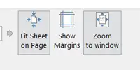
On the example below Fit Sheet to Page and Zoom to Window buttons are Toggle
buttons and both of them are in the Pushed state.

Show Margins is also Toggle button, but Pushed state is false.